The Quiet Power of Illustration in Product Design
Illustration is often treated as decoration, but in product design it can do much more than make things look nice. I use illustration to clarify ideas, build trust, and bring a more human feel to digital products.
In this article, I’ll share how thinking strategically about illustration shows up across a few projects, from avatars to product moments to brand mascots, and why it works best when it’s treated as part of the product, not an afterthought.
Designing with Intent
Because my background spans both fine art and product design, I tend to approach illustration the same way I approach UX. I start by asking what problem it’s solving, who it’s for, and how it needs to scale.
The style may change from project to project, but the mindset stays the same. Illustration should belong to the product, work within real constraints, and earn its place.
A few principles guide my approach:
- Clear before clever
- Consistent before expressive
- Flexible enough to evolve
Avatars: Identity at a Small Scale
I designed a set of avatars meant to represent users in a lightweight, approachable way. The challenge wasn’t personality, it was usefulness.
TrChelsea
TrFelix
TrShamila
TrAlex
TrTorsten
TrCathy
TrIggy
TrFranklin
TrImran
TrMaria
TrRachel
TrEric
TrHelen
TrEnrique
TrSophia
TrHarry
TrStu
TrNancy
TrChad
TrSamantha
Avatars live at small sizes and across many contexts. They need to feel human without becoming distracting, and detailed without becoming fragile. Early exploration focused on variation, but the real progress came from removing anything that didn’t meaningfully contribute.
The final avatars relied on simple shapes, neutral expressions, and flexible variation. They were easy to extend, easy to maintain, and most importantly they felt native to the product instead of layered on top.
Dog Walking App: Illustration as Reassurance
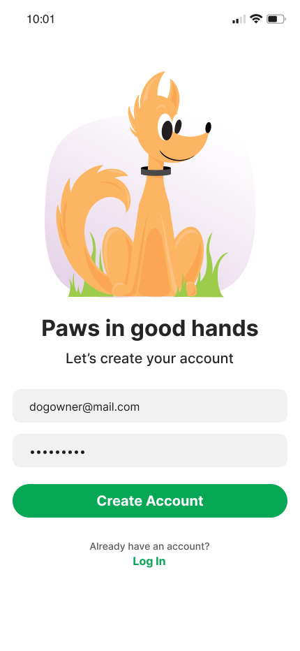
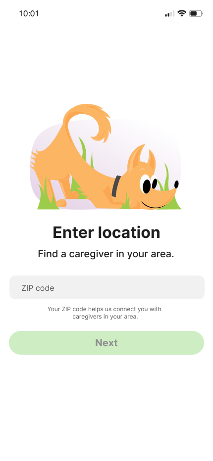
Illustration plays a very different role in a pet care product. Here, the goal wasn’t identity, but trust.
Users are leaving their pets in someone else’s care, so the illustrations needed to feel calm, supportive, and reliable. These visuals showed up in moments like onboarding and empty states, places where users might hesitate or feel unsure.
The illustrations were intentionally restrained. They weren’t meant to stand out, but to soften the experience and reduce anxiety without getting in the way.
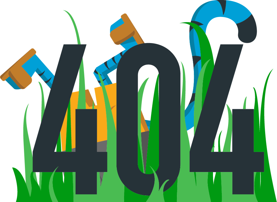
Tyger: Personality, Mascots, and Error States
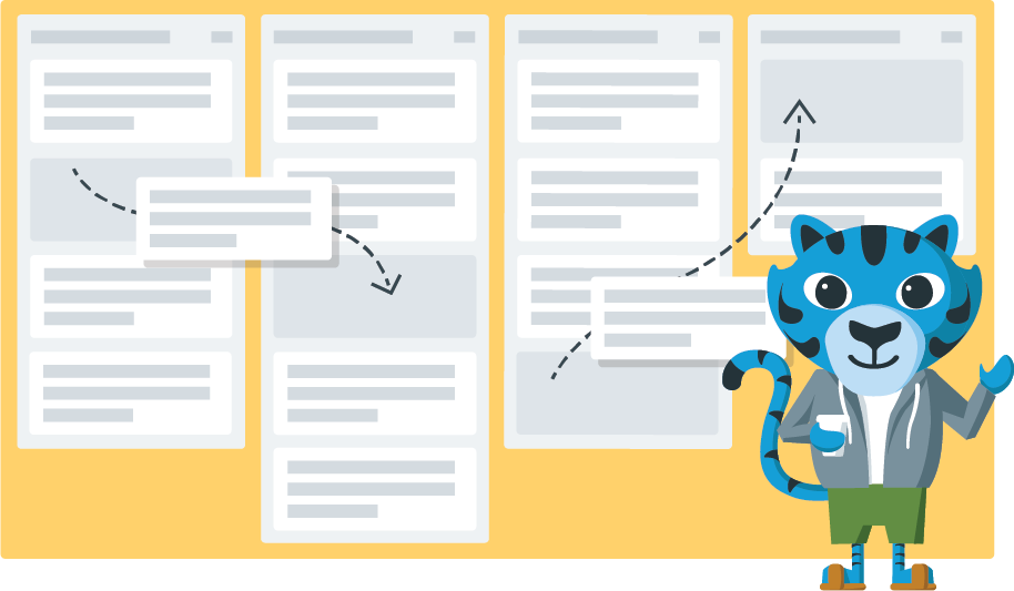
Tyger allowed for more play. This project included creating a tiger mascot, a 404 error state, and other branded illustrations designed to express personality and reinforce the brand.
The mascot started with defining character traits, friendly, confident, energetic, and evolved into a visual voice that could flex across different moments without feeling random.
Even in spaces like error states, the goal was still balance. The illustrations acknowledged friction with humor, but never at the expense of clarity or usability.
Same Process, Different Outcomes
While these illustrations look very different, they all come from the same approach.
- Avatars focus on identity and scalability
- Product illustrations focus on clarity and reassurance
- Mascots focus on personality and memorability
What changes is the role illustration plays, not the intention behind it.
Illustration as Part of a System
Illustration works best when it’s system-aware. Like components, it benefits from clear rules, defined usage, and consistency. When illustration is designed as part of the system, it scales more easily and becomes something teams can build on instead of work around.
Closing Thoughts
Illustration has shaped how I think as a product designer. It pushes me to be intentional, to focus on what really needs to be communicated, and to remember that products are used by people—not just workflows.
For me, illustration isn’t separate from UX. It’s another way of solving problems. When it’s grounded in purpose, it doesn’t need to be loud to be effective—it simply helps products feel clearer, calmer, and more human.