EV Scheduling Drawer
Led the redesign of Synop’s scheduling workflow, creating a unified drawer system that brings scheduling, filtering, and real-time depot data together—helping operators work faster and with greater confidence.
Background
Synop has been rapidly evolving into a central operating system for commercial EV fleets—bringing together charger management, vehicle telematics, load forecasting, and energy optimization. As workflows grew more complex, scheduling became a major friction point: operators had to plan charging sessions and trips while referencing real-time depot data, yet the existing experience relied on modals and page transitions that forced them out of context. This led to repeated steps, scheduling errors, and limited visibility into upcoming activity—turning a routine action into a fragmented, error-prone workflow.
Role and responsibilities
I led the end-to-end redesign of this workflow with a focus on clarity, consistency, and scalability. Rather than patching isolated pain points, I introduced a reusable drawer interaction model that keeps operators anchored in their workflow while supporting scheduling, filtering, and future operational tasks across multiple surfaces in the product. Because even small scheduling mistakes can cascade into route delays, idle chargers, and unnecessary support escalations, this redesign reduced cognitive load, improved decision-making, and established a consistent pattern that now underpins key workflows across the Synop platform.
Requirements
- Create a unified, intuitive interaction pattern for both filtering and scheduling workflows.
- Preserve context so users could schedule directly from the site detail page without navigating away.
- Provide clear visibility into near-term activity (24 hours to 1 week) to reduce conflicts and improve planning confidence.
- Ensure the solution was fully scalable across desktop and mobile and reusable across multiple pages.
These requirements helped us frame the drawer not just as a UI component, but as a platform-level pattern designed to reduce fragmentation across the product ecosystem.
Design Process
Research and Insights
Our research and usability feedback revealed a clear set of themes: operators needed to see chargers, vehicles, and upcoming events in context while scheduling, and they relied on clear, immediate feedback to avoid overlaps or conflicts in time-sensitive workflows. We also found that inconsistent patterns across pages increased the mental effort required to complete tasks, leading to avoidable errors—an issue that became even more pronounced on mobile, where many operators work on-site with limited screen space. These findings collectively shaped the decision to design a context-preserving drawer system that supports confident, consistent scheduling across devices.
Constraints
This project came with key constraints: limited engineering bandwidth meant the design needed to build on existing components; tight mobile screen space required a careful balance of information density and clarity; and the solution had to scale across scheduling, filtering, historical review, and future predictive features. These factors reinforced the need for a context-preserving pattern that minimized surface area and could evolve without rework.
Exploring Alternatives
My early exploration examined how users moved through scheduling and where they lost context, leading me to test modals, side panels, and full-page flows. Usability reviews showed that modals lacked space for complex inputs and full-page flows pulled users away from essential operational data. The drawer emerged as the strongest solution, keeping the site detail page visible, introducing a clearer input hierarchy, and surfacing near-term scheduling data without screen changes. This work also clarified the information architecture for later wireframes.
User Journey Map
The final user flow was designed to minimize mental effort and support confident decision-making by keeping users in context throughout the scheduling process. It allows operators to initiate actions directly from the site detail page, set parameters, preview conflicts, and confirm events—all without disruptive navigation or losing sight of critical information.
Wireframes for Drawers
During wireframing, I focused on establishing a clear hierarchy that helped operators quickly scan required fields, stay oriented in their workflow, and make confident scheduling decisions. Progressive disclosure prevented advanced options from overwhelming the core tasks, clear labeling reduced common errors, and accessibility standards guided tap targets, contrast, and time inputs. These wireframes helped validate the content structure early and refine the flow before moving into visual design.
Final Experience
The final drawer experience provides a cohesive, scalable interaction model that supports scheduling, filtering, and previewing activity—all without leaving the user’s context.


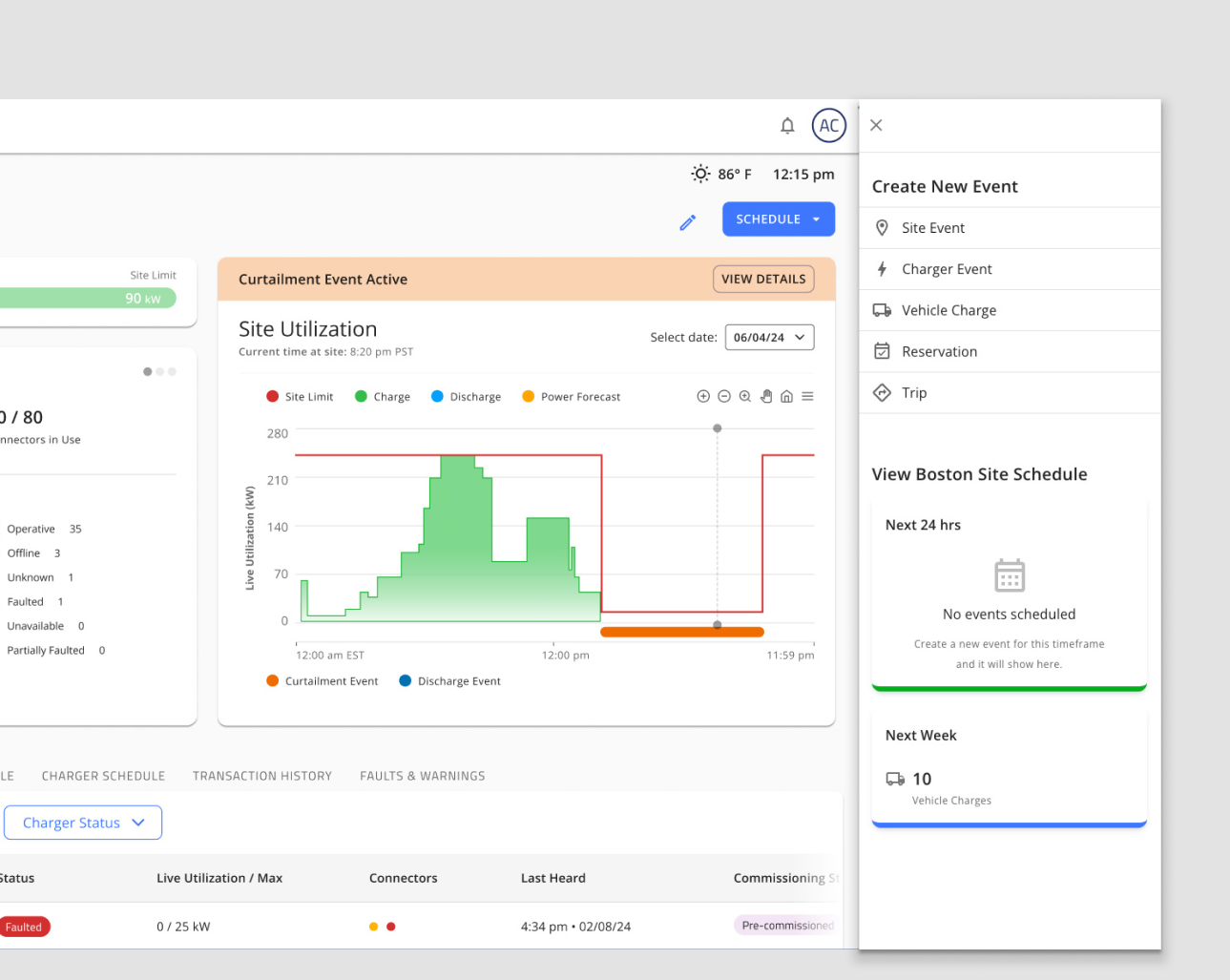
Scheduling drawer open on the site detail page, showing upcoming events and scheduling options.
Key improvements include:
- A persistent drawer that keeps the user in context while they schedule events
- Real-time visibility into upcoming events within the same component
- Improved consistency in terminology and microcopy across scheduling surfaces
- A responsive layout that maintains clarity and usability across desktop and mobile
- A reusable drawer component that can be used across the app
Below is an example of the second schedule button on the site detail page. By placing a second button within the Schedule Timeline further down the page, we can keep the user in context while they schedule events from multiple locations on the site detail page.
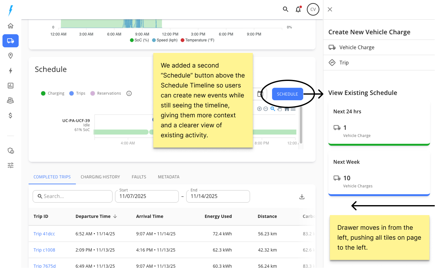
Showing the second schedule button on the site detail page
Reusable Drawer Component Use Cases
This pattern has now been adopted across the app, reducing UI fragmentation and accelerating future build velocity. It is now additionally used in the following use cases:


Design Rationale
The drawer pattern was chosen because it solved the core usability and workflow challenges uncovered in research while providing a scalable foundation for future features. It preserved context by keeping site and charger details visible during scheduling, supported a clear information hierarchy through progressive disclosure, and adapted naturally to mobile constraints. Its flexibility also allowed the same interaction model to power scheduling, filtering, and activity review without redesigning each surface independently—positioning the drawer as a strategic, platform-level pattern rather than a single UI element.
Estimated Impact
Based on feedback from the internal team and early usability reviews, we estimated the following impact on scheduling accuracy, speed, and overall workflow efficiency:
Reflection & Future Opportunities
This project reinforced the value of designing patterns that scale alongside features. If I were to continue iterating, I would explore:
- Improving multi-day scheduling support, reducing unnecessary steps
- Enhancing how the drawer interacts with the broader page layout
- Supporting predictive scheduling assistance based on vehicle and charger availability
- Expanding the drawer pattern to handle more complex state awareness (e.g., warnings, system-generated events)
This work became a foundation for future operational features, and it strengthened my approach to designing reusable, system-level interaction patterns.