Accessibility in Design Benefits Everyone
Accessibility in design is often framed as a set of rules, ratios, or compliance requirements. But at its core, it's about people moving through the world, perceiving information, and how design either supports them or simply gets in their way.
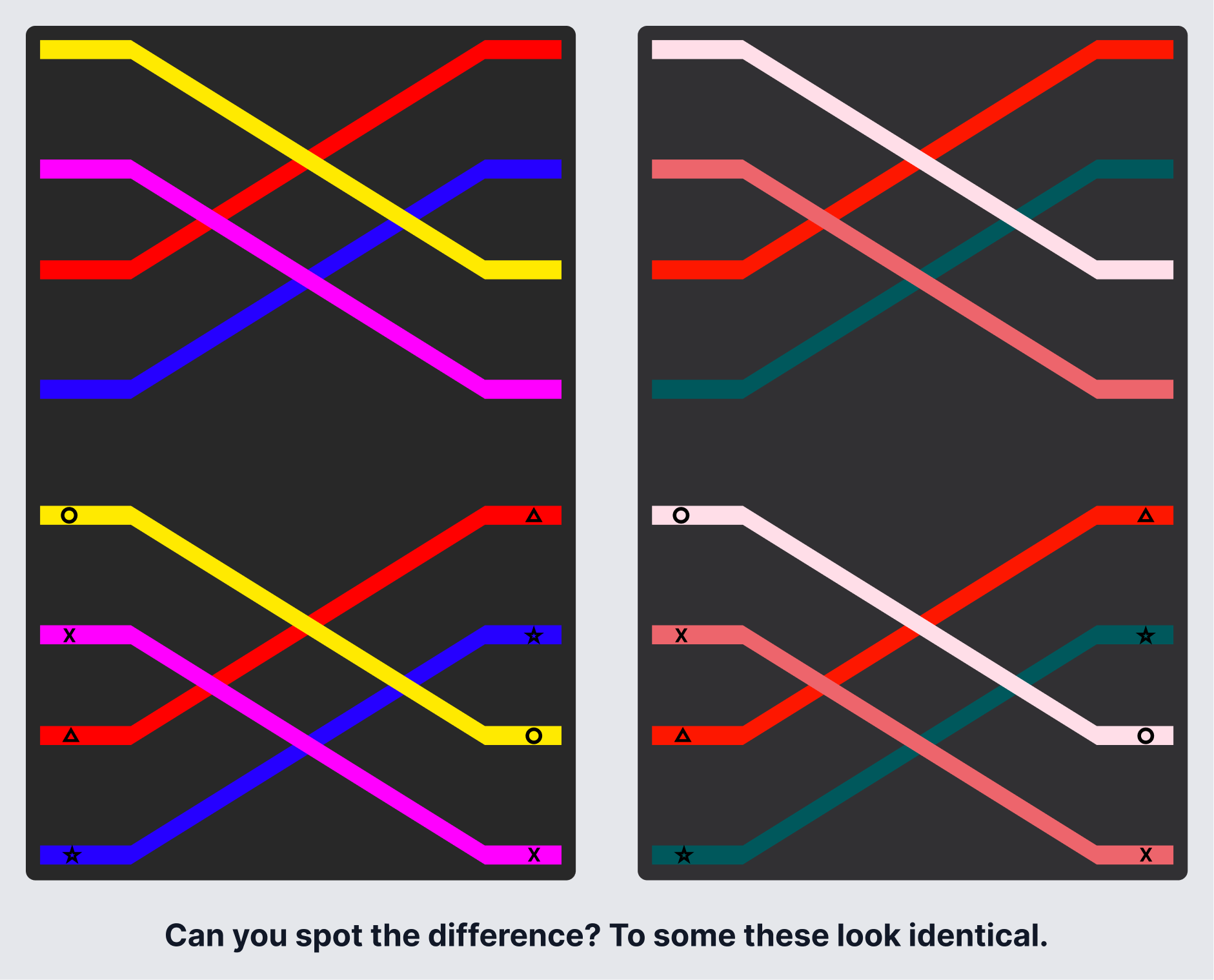
If you only had the image on the right, and I asked you to pick the pink line, could you? Add in the stress of completing a game in a hurry, and you might not be able to tell the difference.
Accessibility isn't a compliance checkbox. It's a reflection of how well your design holds up when it meets real people and real life situations.
When we talk about accessibility, we tend to picture permanent disabilities. In reality, disability exists on a much wider spectrum. Millions of people are disabled, and millions more are functionally disabled in certain contexts, whether that's temporarily, situationally, or without ever identifying as disabled at all. Do you wear glasses or contacts? How often do you multitask?
Accessibility isn't rare, and it isn't theoretical. It affects millions of people, many of whom don't identify as disabled, and when businesses ignore it, the cost shows up in lawsuits, lost customers, and broken trust.
Who Benefits from Accessibility?
Everyone does. It's not a niche requirement. Here are a few examples you've probably run into yourself:
- Closed captions help people watch videos in noisy rooms, quiet spaces, or in a second language, not just for those with hearing loss.
- Curb cuts, originally designed for wheelchairs, are used daily by parents with strollers, travelers with luggage, cyclists, and delivery workers.
- High color contrast makes interfaces easier to scan in bright sunlight or on an aging screen.
- Icons, labels, and color-coded patterns reduce cognitive load and remove ambiguity, regardless of ability.
- Dark mode, adjustable text sizes, and motion reduction settings exist because people experience light, movement, and focus differently.
Like good UX, good accessibility doesn't call attention to itself. It just works.
Accessibility Lives in the Fundamentals
Accessibility doesn't start with edge cases. It starts with how people actually interact with products. Some users navigate entirely by keyboard. Others rely on screen readers. Some are using one hand on a phone while distracted. Have you ever tried to send a text while eating or holding a crying baby? If someone can't tab through an interface, understand what's being read aloud, or complete a critical flow without precision input, the product may be technically "usable" but functionally inaccessible. Good accessibility comes from designing for different ways of interacting, not assuming there's a single default user.
The same is true for clarity. Forms, typography, and layout often introduce friction even for users without disabilities. Confusing instructions, unclear required fields, inconsistent patterns, tiny text, and low-contrast helper copy all compound cognitive load. As Steve Krug argues in Don't Make Me Think, people don't come to your site or app to admire your UI. They come to solve a problem and get back to their lives. This is where small, thoughtful design decisions make a disproportionate impact. Readability, hierarchy, and reducing ambiguity are all part of that.
Color Contrast Goes Deeper Than You Think
Most designers know the WCAG recommendation: a 4.5:1 color contrast ratio. It's an important baseline, but not the finish line. Color contrast is often discussed in the context of low vision, but it also intersects with color blindness, which comes in many forms beyond the commonly tested red/green type.
A few years ago, I found out our daughter is color blind. We didn't discover it until she was sixteen.
She'd always passed the standard red-green tests at the eye doctor. What she has is a less common type called Tritanopia, though even that label isn't exact. She can still see yellows, but reds and pinks blend together, as do yellows and greens. Suddenly, all those childhood disagreements over color names made sense.
She shared a game design with me so I could see what she was experiencing. That game used symbols alongside color, which allowed her to solve the puzzles. A similar game with the same challenge but no symbols, just color, was nearly impossible for her to navigate.
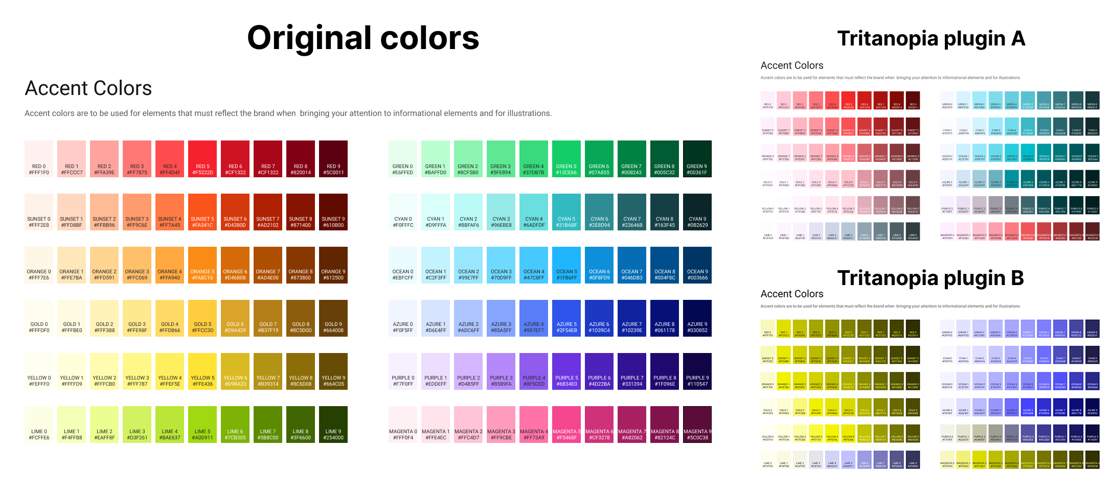
I've since used color blindness simulation plugins in Figma to get a rough sense of what she sees. The two images on the right show the same palette run through two different plugins, both claiming to simulate Tritanopia. They don't match. And neither fully matches what she describes. Tools are a useful starting point, but they're an approximation, not a substitute for talking to the people you're designing for. That experience changed how I think about color in design. I no longer assume that what I see is what others see, or that passing a contrast check means an experience is actually clear for everyone.
Even when you can't make every color combination aesthetically ideal, you can still make color accessible:
- Don't rely on color alone to convey meaning
- Pair color with labels, icons, or patterns
- Name colors clearly instead of implying meaning
- Test beyond automated checks: simulate, observe, and ask
Good design and accessible design aren't at odds. Removing ambiguity is part of the craft.
Context Matters: Devices, Media, and Environment
A design that works on desktop may fail on mobile if touch targets are too small, layouts break when text is resized, or content is blocked by pop-ups and auto-playing media. Responsive design isn't just about screen size. It's about adaptability.
The same applies to multimedia. In our house, captions are almost always on when we watch a movie. That's increasingly common. More people use captions because they're multitasking, in shared spaces, dealing with poor audio, or they simply process information better visually. Captions, transcripts, and alt text support users with disabilities, but they also make content more flexible, searchable, and resilient for everyone.
Accessibility Is Ongoing Work
Accessibility isn't a one-time task or a box to check. It requires regular audits, real user feedback, collaboration with engineering, and a willingness to revisit decisions as products evolve. No product gets this right on the first try. What matters is building the habit of returning to it.
Accessibility isn't really about designing for "other people." It's about designing for real humans in real contexts, with real constraints, many of which we'll all encounter at some point. When we design accessibly, we don't just follow guidelines. We build products that hold up against the full range of human experience. And that's not just good ethics. It's good design.