The Quiet Power of Illustration
The best illustration in a product is often the one you barely notice. It doesn't call attention to itself. It just makes the experience feel a little calmer, a little clearer, a little more like something a person made.
All of it started as pencil on paper. Tools like Illustrator came later, once I knew what I was trying to say.
Illustration has shaped some of my most interesting work, from avatars to product moments to brand mascots. It works best when it’s treated as part of the product, not as an afterthought.
Designing with Intent
Because my background spans both fine art and product design, I tend to approach illustration the same way I approach UX: what problem is it solving, who is it for, and how does it need to scale.
The style may change from project to project, but the mindset stays the same. Illustration should belong to the product, work within real constraints, and earn its place.
A few principles guide my approach:
- Clear before clever
- Consistent before expressive
- Flexible enough to evolve
Avatars: Identity at a Small Scale
Avatars almost always live at small sizes, tucked into a corner of an interface and easy to overlook. The challenge wasn't personality. It was usefulness.
TrChelsea
TrFelix
TrShamila
TrAlex
TrTorsten
TrCathy
TrIggy
TrFranklin
TrImran
TrMaria
TrRachel
TrEric
TrHelen
TrEnrique
TrSophia
TrHarry
TrStu
TrNancy
TrChad
TrSamantha
I wanted them to feel human and approachable, but more caricature than portrait, representative without being a direct likeness of any individual. The real progress came from removing anything that added noise without adding clarity: clothing details, jewelry, anything that made them harder to read at small sizes.
The final set relied on simple shapes, neutral expressions, and flexible variation across skin tone and features. They're easy to extend, easy to maintain, and most importantly, they feel native to the product rather than layered on top.
Dog Walking App: Illustration as Reassurance
Handing your pet to a stranger is an act of trust. In a product asking users to do exactly that, illustration can't afford to be decorative. It has to do emotional work.
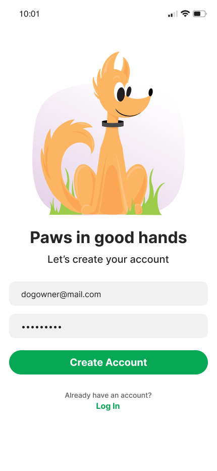
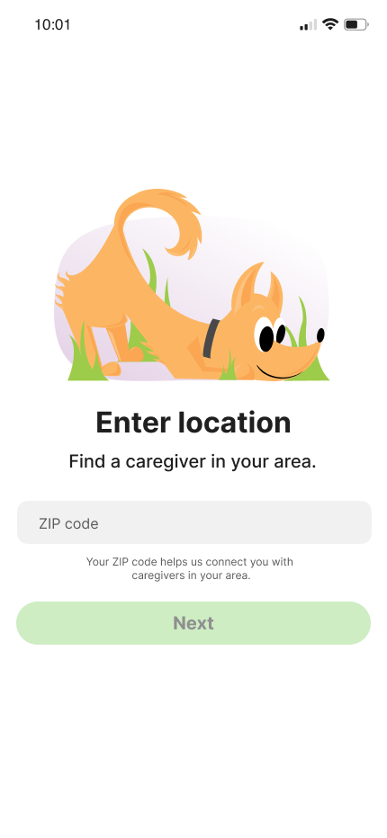
The illustrations appeared in moments where users were most likely to hesitate: onboarding, empty states, the gaps between deciding and committing. The goal wasn't to delight. It was to reassure.
I used a muted palette throughout, not to stand out, but to create a sense of calm that made the experience feel steady and considered. The illustrations stay out of the way of the user's actual goal, while quietly making it easier to take the next step.
Tyger: Personality, Mascots, and Error States
Tyger was the project with the most room to play, and the most room to get it wrong. A mascot lives everywhere: onboarding, error states, empty screens, marketing. If the character isn't coherent, it starts to feel random. If it's too loud, it gets in the way.
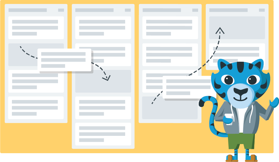
I started by defining what the character needed to be before deciding what it looked like. The traits (friendly, confident, a little irreverent) had to hold across very different contexts without feeling forced into them.
Error states were the real test. It's easy to lean on humor when things break, but humor that distracts from recovery isn't doing its job. The illustrations had to acknowledge friction without making the user feel like the product was laughing at them.
Same Process, Different Outcomes
The avatars, the dog walking app, the Tyger mascot. They look nothing like each other. But they came from exactly the same questions: What does this need to do? Who is it for? What would get in the way?
That's what I mean by illustration as a design practice rather than a visual style. The output changes because the context changes. The thinking doesn't.
Illustration as Part of a System
Illustration works best when it's built into the system from the start. Like a component, it needs clear rules and defined usage, not to constrain it, but to make it something teams can build on rather than work around.
Thinking this way has shaped how I approach design more broadly. Illustration asks you to be precise about what something needs to communicate before you decide what it looks like. That constraint is useful. It pushes you past decoration toward decisions that actually serve the person using the product.
For that reason, illustration has never felt separate from UX to me. It's just another way of solving problems, and when it's grounded in purpose, it doesn't need to be loud. It quietly makes products feel clearer and more human. And that's enough.