Go City App
Solving key usability gaps by streamlining itinerary creation and clarifying pass information, turning a confusing multi-step process into a cohesive and effortless travel-planning experience.
About Go City
Go City offers multi-day passes to major attractions around the world. Users purchase a pass once and then enjoy simplified entry without buying individual tickets. The value proposition is convenience and cost savings—but the app experience doesn’t fully support that promise.
Challenge
Uncover critical pain points in the Go City app and redesign key flows to make itinerary planning simpler, clarify pass status at important moments, improve conversion opportunities after expiration, and encourage travelers to share the value they received.
Goals
- Simplify itinerary creation so users can focus on enjoying their trip and discovering attractions.
- Increase conversions seamlessly and at key moments, particularly when a pass expires.
- Encourage advocacy by making it easy for users to share their savings and visited attractions.
App Analysis: Key Issues Identified
Redundant navigation and Inconsistent hierarchy
Both Explore and Attractions pages contain similar content, but require users to switch back and forth to find and save attractions they want to visit with no clear hierarchy or visual connection.
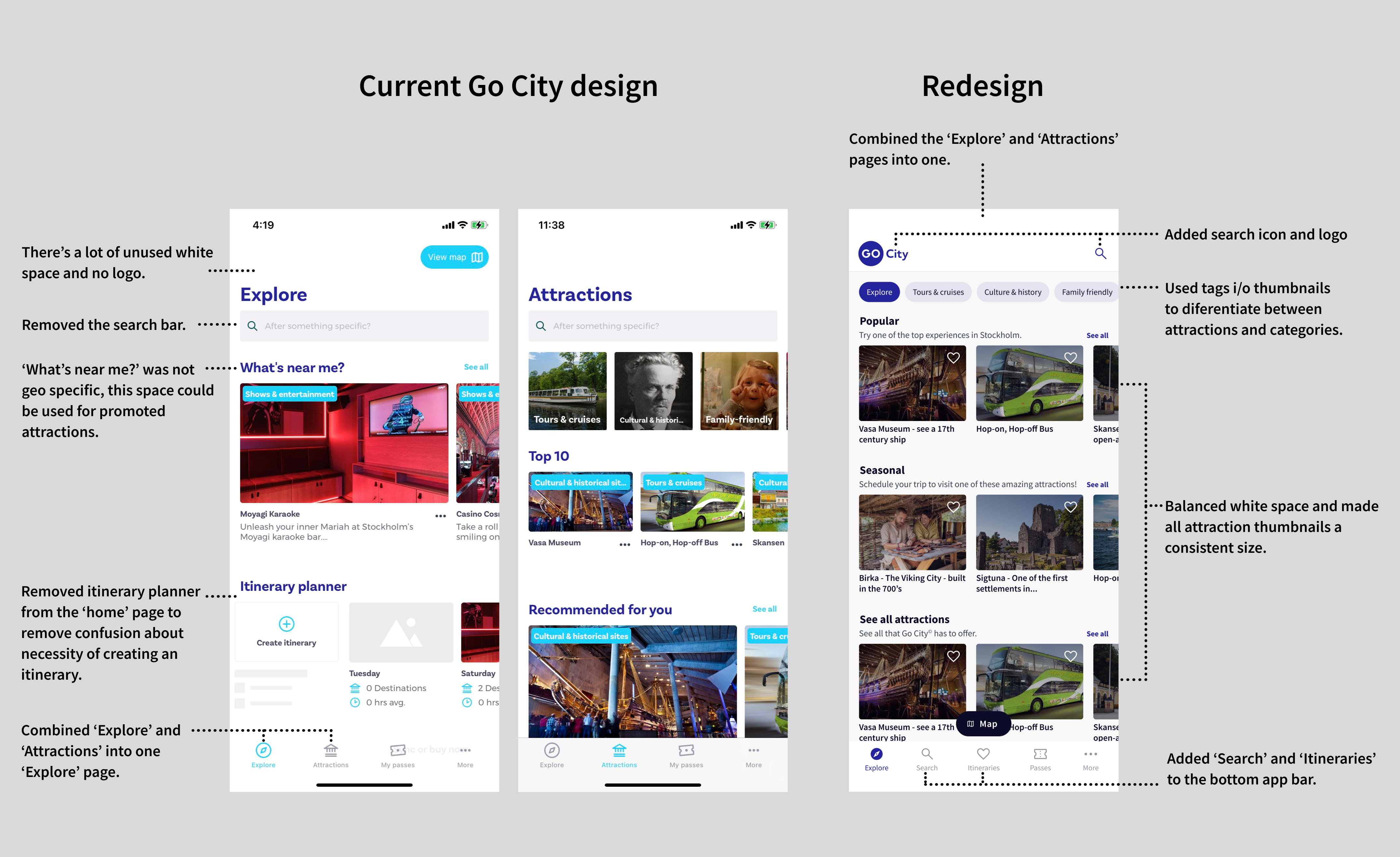
Comparing the current and redesigned Go City app homepages
Saved items vs. itineraries
Saving attractions and creating itineraries are separate tasks with no direct linkage, adding cognitive load—especially for travelers on the go.
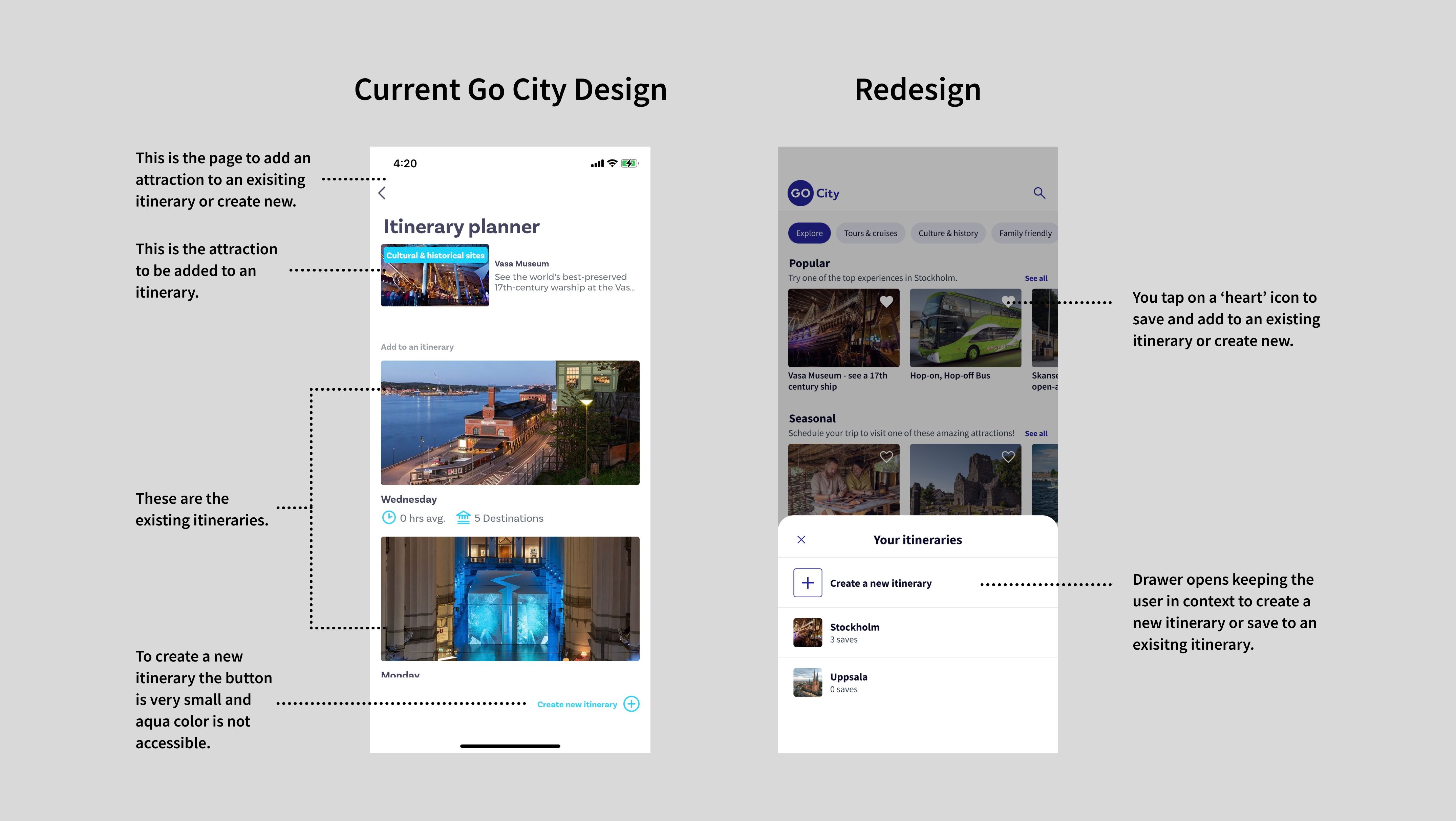
Comparing the current and redesigned Go City app save to itinerary flow
Disruptive itinerary creation
The user is taken out of context when naming or saving to an itinerary, and large thumbnails require unnecessary scrolling.
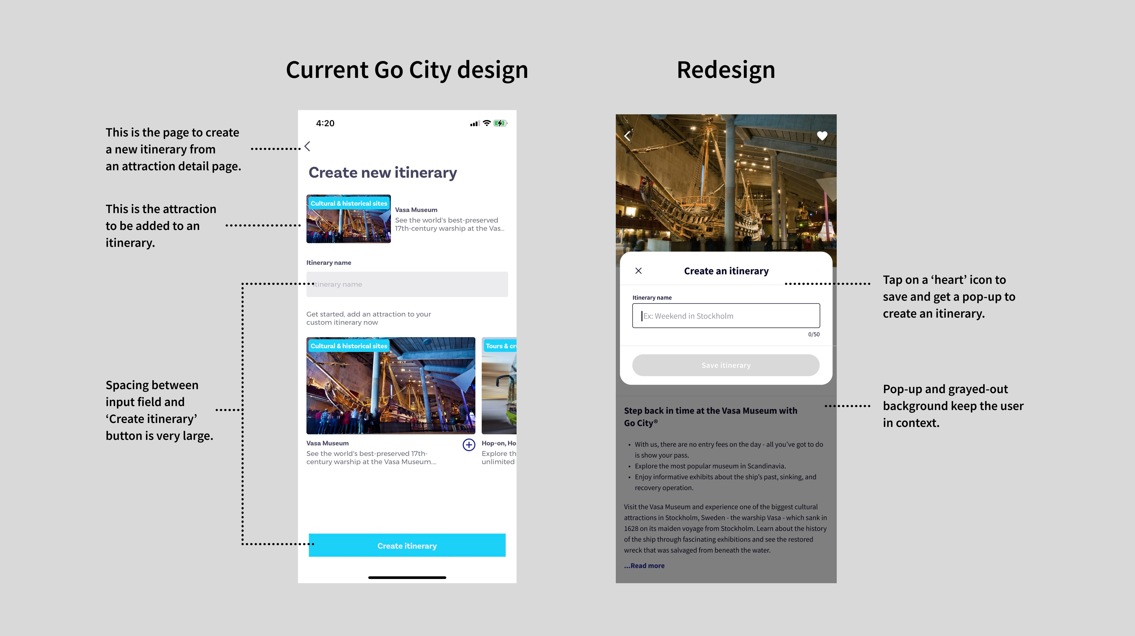
Comparing the current and redesigned Go City app individual attraction to save flow
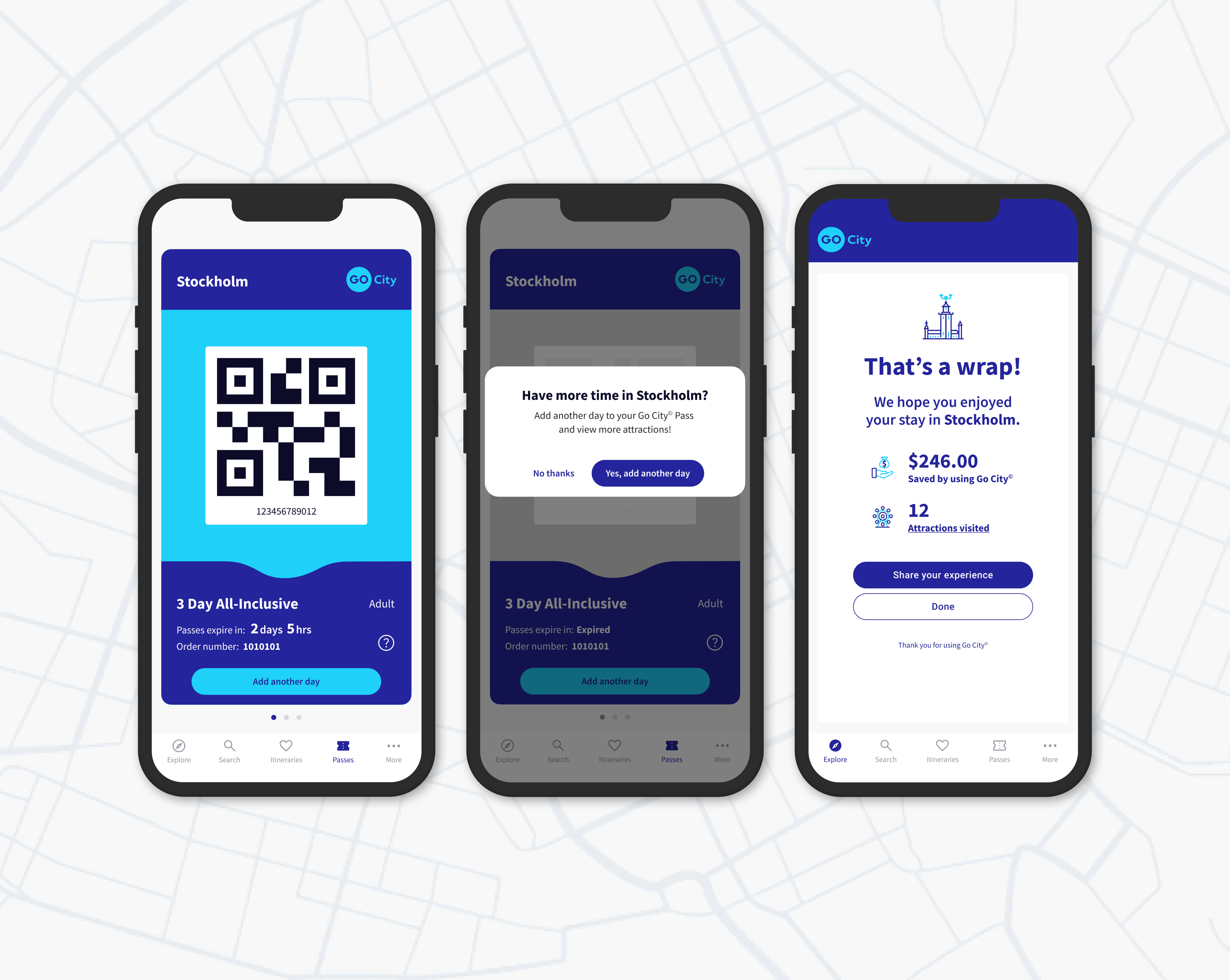
Confusing pass status
Expired passes still display the original 2-year validity period, leading to misunderstanding about expiration.
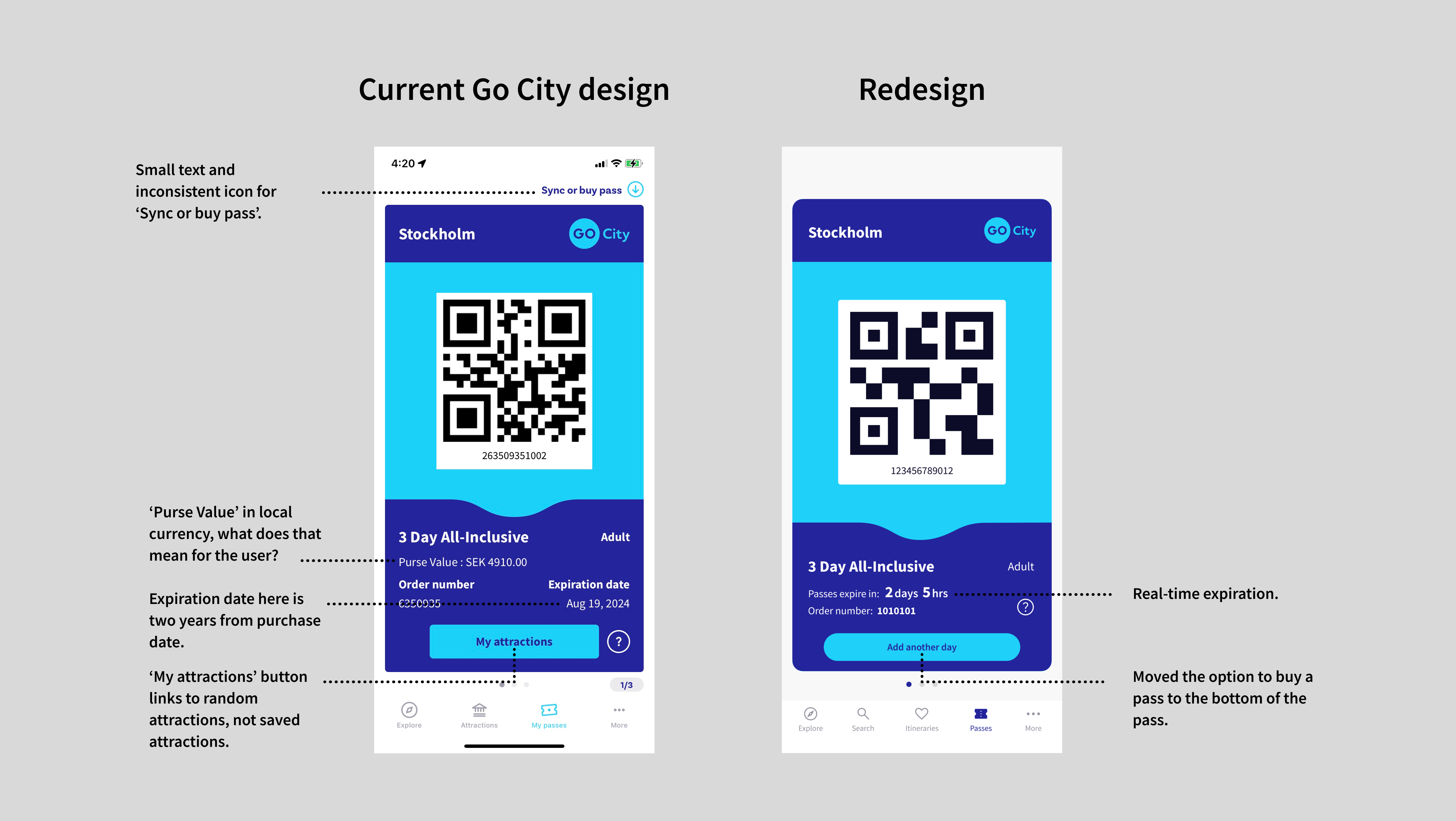
Comparing the current and redesigned Go City app passes and expiration flow
Missed conversion opportunities
After a pass expires, there are no notifications or prompts to renew, extend, or learn about new offers.
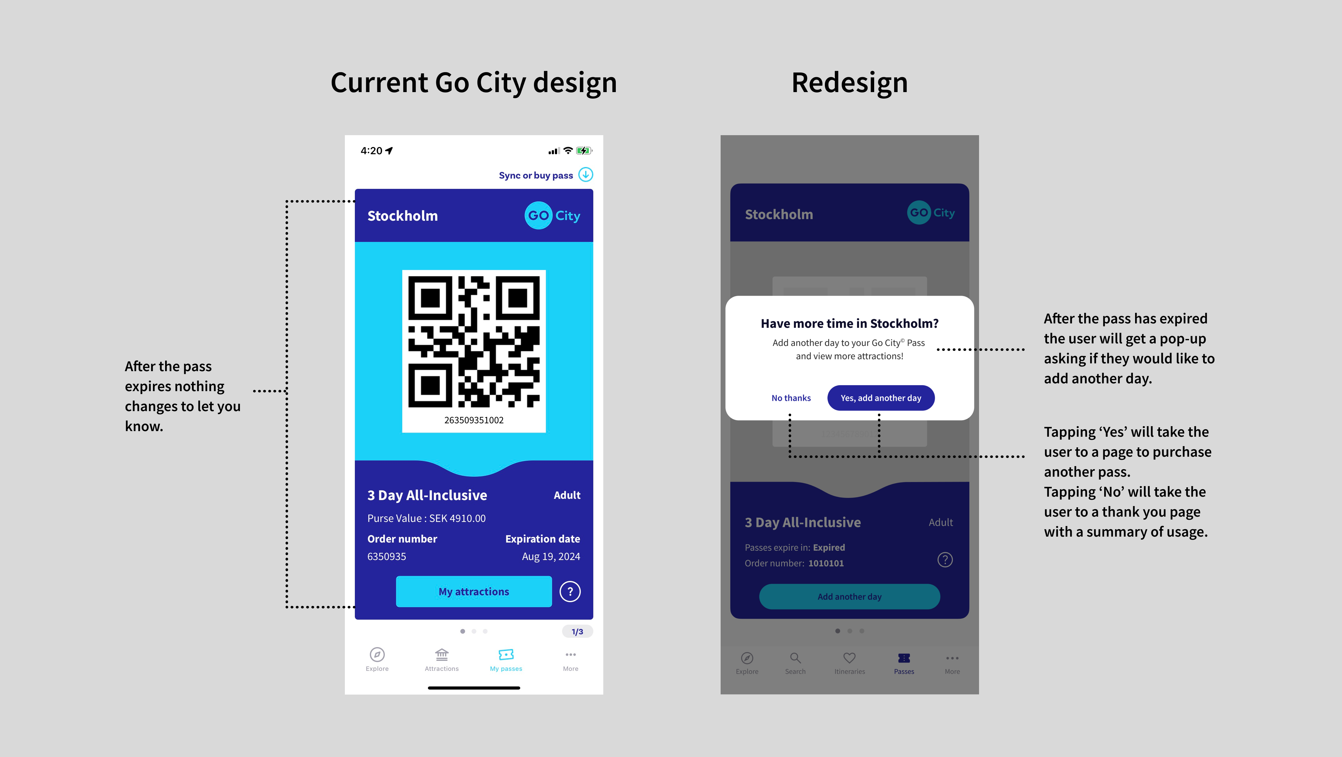
Comparing the current and redesigned Go City app after expired pass flow
User Journey Map
Mapped the end-to-end journey, highlighted where users lose context, and identified where the UI introduces unnecessary steps during discovery and planning.
High-Fidelity Prototype
Converted the strongest concepts into high-fidelity screens in Figma, highlighting the key improvements in clarity, flow, and navigation.
Create and Edit Itinerary
Creating and editing itineraries are now combined into a single flow. Users can add attractions to their itinerary by tapping the heart icon, and edit or delete them easily from the menu icon.


Passes and Expiration
After a pass expires, users are prompted to extend or renew their pass. They can also share their experience on social media, and see how much they saved.


Key Improvements in the Redesign
- Combined Explore + Attractions = Faster Discovery: Users visit these pages for the same job: to find something to do. Consolidating the pages reduces duplication and scroll depth, making it easier to find and save attractions.
- Unified Saving & Itinerary Creation = Fewer Steps: Users shouldn’t have to choose between two similar actions. Combining them follows a standard mental model from apps like Google Maps (“Save to…”) and Airbnb (“Add to wishlist”).
- Contextual Pop-Up for Itinerary Creation = Higher Flow Retention: Taking users to a full-page form breaks their flow. A modal or drawer keeps them anchored to where they were, supporting continuity (Fitts’s Law + Hick’s Law).
- Clear Expired-Pass State With Upsell = Increased Conversions: An expired pass is a natural decision moment, yet the original app doesn’t acknowledge it.
- Savings Summary + Share Prompt → Boosts Advocacy: Showing users the value they received strengthens satisfaction and increases likelihood of sharing—a common retention tactic used by ride-share and financial apps.
Estimated Impact & Results
Conclusion
This redesign elevates the Go City experience by improving clarity, minimizing friction, and introducing natural opportunities for upsell and advocacy. By simplifying mental models and supporting users at key decision moments, the updated interface delivers on what travelers expect from a great travel app: intuitive planning, transparent information, and a more enjoyable journey from start to finish.
This is an independent, conceptual UX case study produced for portfolio presentation. I am not associated with Go City.